
Il Cinema Ritrovato
For this project, I was given the task of creating a branding and communication strategy for a film festival of my choice, and I selected “Il Cinema Ritrovato”. This festival is dedicated to showcasing restored classics and unknown treasures from different corners of the world, with a focus on the history of cinema. To kick off this branding project, I started by asking myself a few questions, such as: How will my brand differentiate?, who is my audience?, what does my festival promise to deliver?
I concluded that the festival should target young adults and teenagers because they tend to overlook older films that may have outdated special effects, black-and-white cinematography, or a slower pace.
In order to reach my intended audience effectively, I chose to create a design system that is playful and vibrant, with a touch of humor. I achieved this by adding sketchy illustrations into the visual system and also using a handwritten-like font, which added a more casual and approachable feel to the design.


Concept 1.
History is all about the details. Paying attention to details is crucial in the study of history. The small aspects provide the most insight into what really happened. Without a focus on details, history would be reduced to oversimplified narratives. This concept uses close-up portraits of movie characters and large typography to showcase the intricacies and the details in the portraits.
Concept 2.
This concept explores how classic films embody the fundamental principles of cinematography. To reference fundamentals, this brand system incorporated the basic design elements of lines, rectangles, and circles.
Concept 3.
This concept highlights the class and significance of classic films by using detailed, ornate classical frames and a limited color palette to convey a sense of elegance.
Concept 4.
One of the main purposes of the festival is to revisit the past. This direction showcases characters from the movies gazing at their films with admiration. As if they are viewing a beautiful painting in a museum or reliving a cherished memory.
Concept 5.
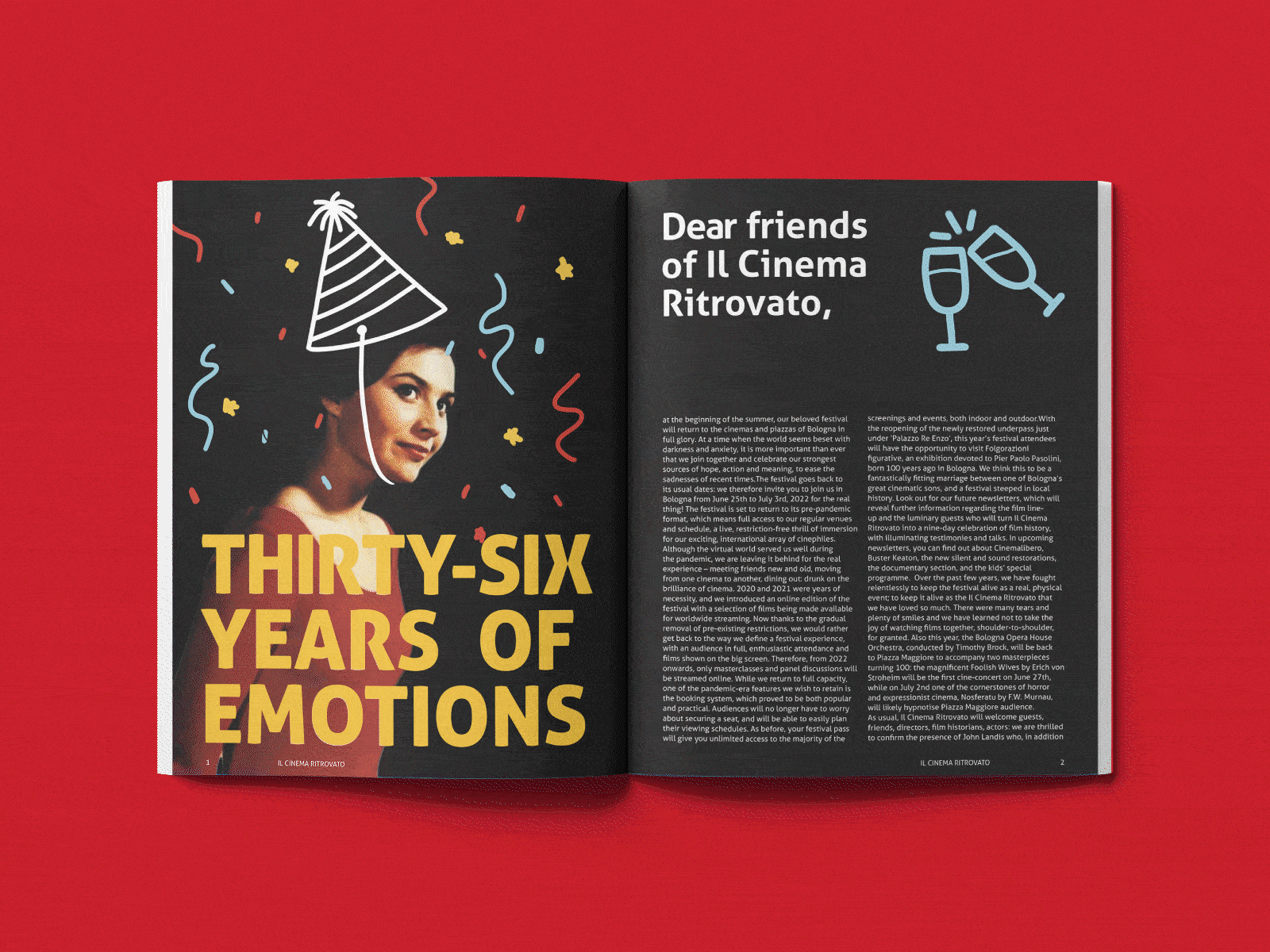
This is how I began my final design. I created a more casual feel to the older films that are sometimes overlooked due to outdated special effects, black-and-white cinematography, or a slower pace. To achieve this, I used my own handwriting for the movie synopsis and dates. To add to the casual feel of the brand, I added simple illustrations on top of the images to give the brand a humorous approach and evoke a sense of curiosity among the younger audience.